

Rosneft
Concept
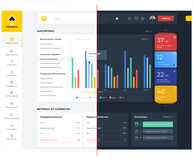
Minimalism and simplicity, the main emphasis is on quick perception of information and the overall picture of the organization
Key sections of the personal account
Header
All the important things at hand: a new task, search, day and night versions, favorites, calendar, messages, personal account and a button to create an urgent order
Projects requiring attention

Official appeals
from employees
from employees

Documents or decisions requiring managerial attention

Status updates
according to issued
instructions
according to issued
instructions

Analytics
Summary data on all key sections of the company’s work in one screen + gallery of notifications
Key slices for analytics

Calendar
with daily events
with daily events
The most important events for the coming days within one widget
Analytics
Status of active projects in the form of a pie chart. Made for convenient perception of information by the user
Interactive Polls
Current Survey Results for Employees and Directors
Important events from other portals
Latest news and events related to Rosneft from third-party sources. Everything that is said about the company in one screen.


Event list
All events, notifications, messages, tasks and more in one sliding tab
In order not to spoil the vision at night after sunset, the interface changes its colors
Day and night versions
Art-direction & Design
Sergey Kerber
Digital agency
Сopyright 2024
@kerber_agency


