
for financial advice
Brand
identity
identity
Best
Finaset
place
about
project
project
Finaset is a financial data company. Information from around the world, covering stock rates, ETFs, Forex, cryptocurrencies and more, is available through proprietary software and API
design
The brief was to create a progressive, modern image, so we developed an identity that vividly contrasts with the patterns of fintech companies. Instead of the hackneyed blue color and complex graphics, we filled the brand with the freshness of Marine Green and the "freedom" that brutalism gives. The final style is simple, easy to read, and creates a sense of an advanced technological brand
logoTYPE
color solutions
pattern
Capital letter-based patterns can be easily transformed without losing readability, which further emphasizes the flexibility and service horizon
typography
color code
Black
HEX – #000
RGB – rgb(1, 1, 1)
CMYK – 0%, 0%, 0%, 100%
RGB – rgb(1, 1, 1)
CMYK – 0%, 0%, 0%, 100%
Green
HEX – #56FD9B
RGB – rgb(86, 253, 155)
CMYK – 66%, 0%, 39%, 1%
RGB – rgb(86, 253, 155)
CMYK – 66%, 0%, 39%, 1%
White
HEX – #FFF
RGB – rgb(255, 255, 255)
CMYK – 0%, 0%, 0%, 1%
RGB – rgb(255, 255, 255)
CMYK – 0%, 0%, 0%, 1%
Gray
HEX – #222F3E
RGB – rgb(34, 47, 62)
CMYK – 45%, 24%, 0%, 76%
RGB – rgb(34, 47, 62)
CMYK – 45%, 24%, 0%, 76%
HOW TO USE
the LOGO
the LOGO
incorrect
paired logos
When using the logo in conjunction with other brands' logos, the bottom line alignment and dimensional ratio must be considered. Balance solves everything
correct
incorrect
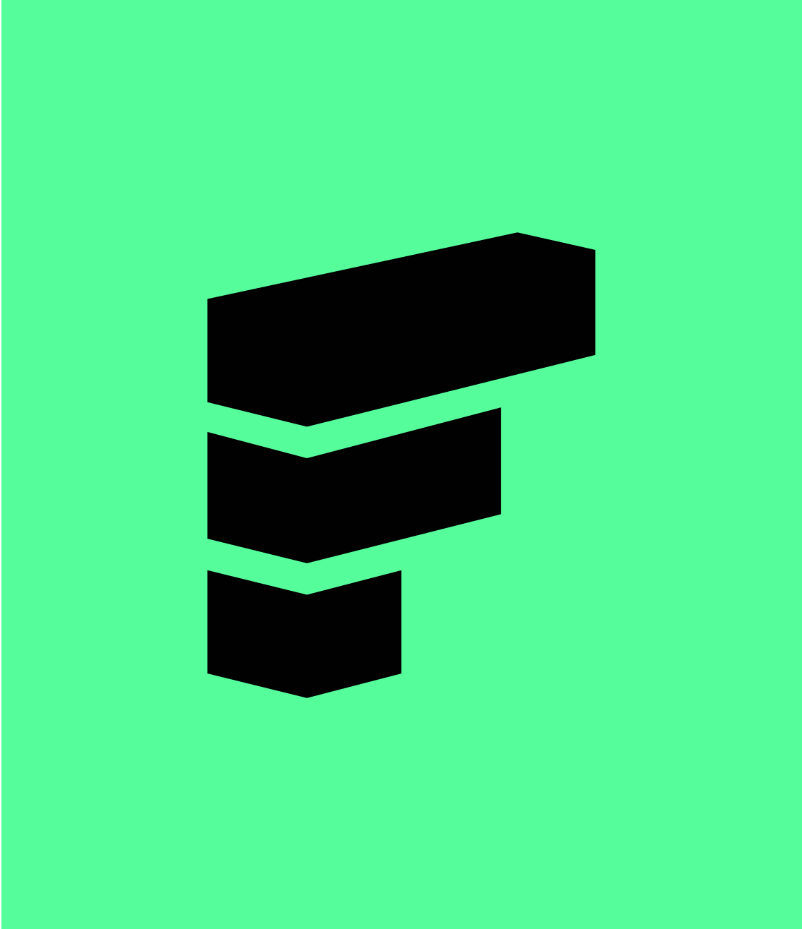
icon
The isometric effect of the logo on the app icon looks stylish and minimalistic
promo
banners
banners
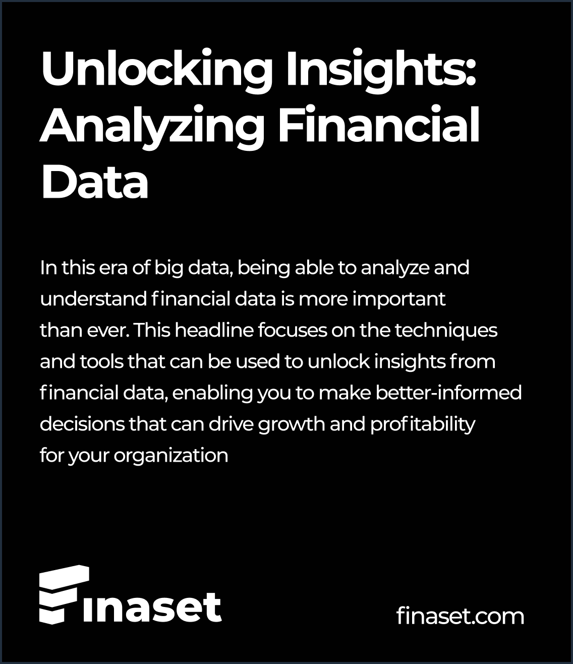
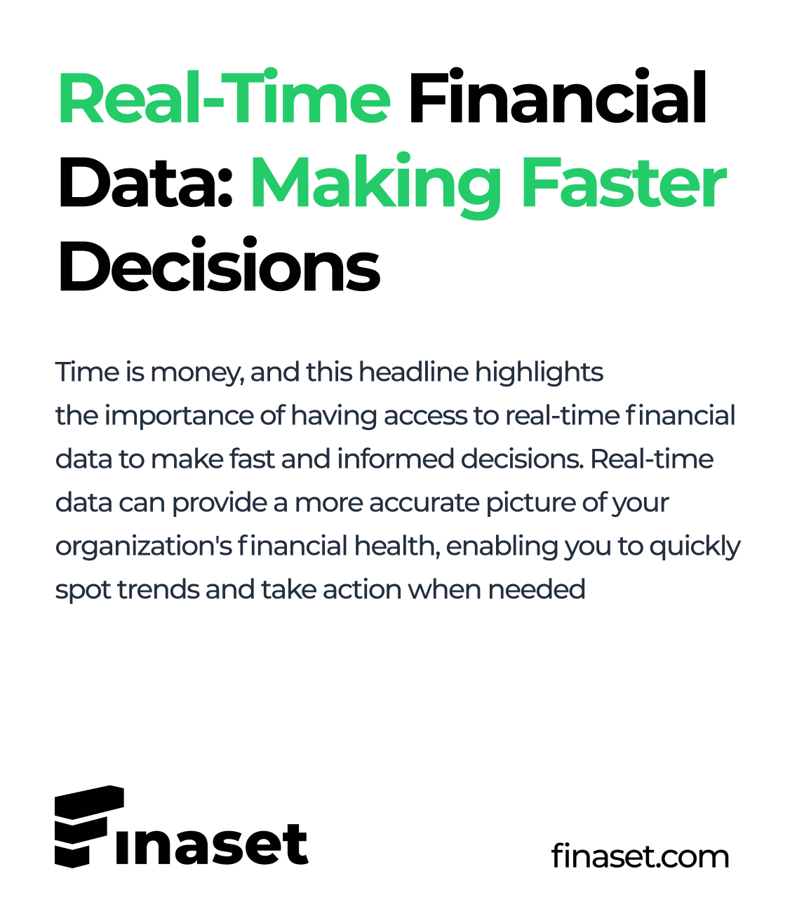
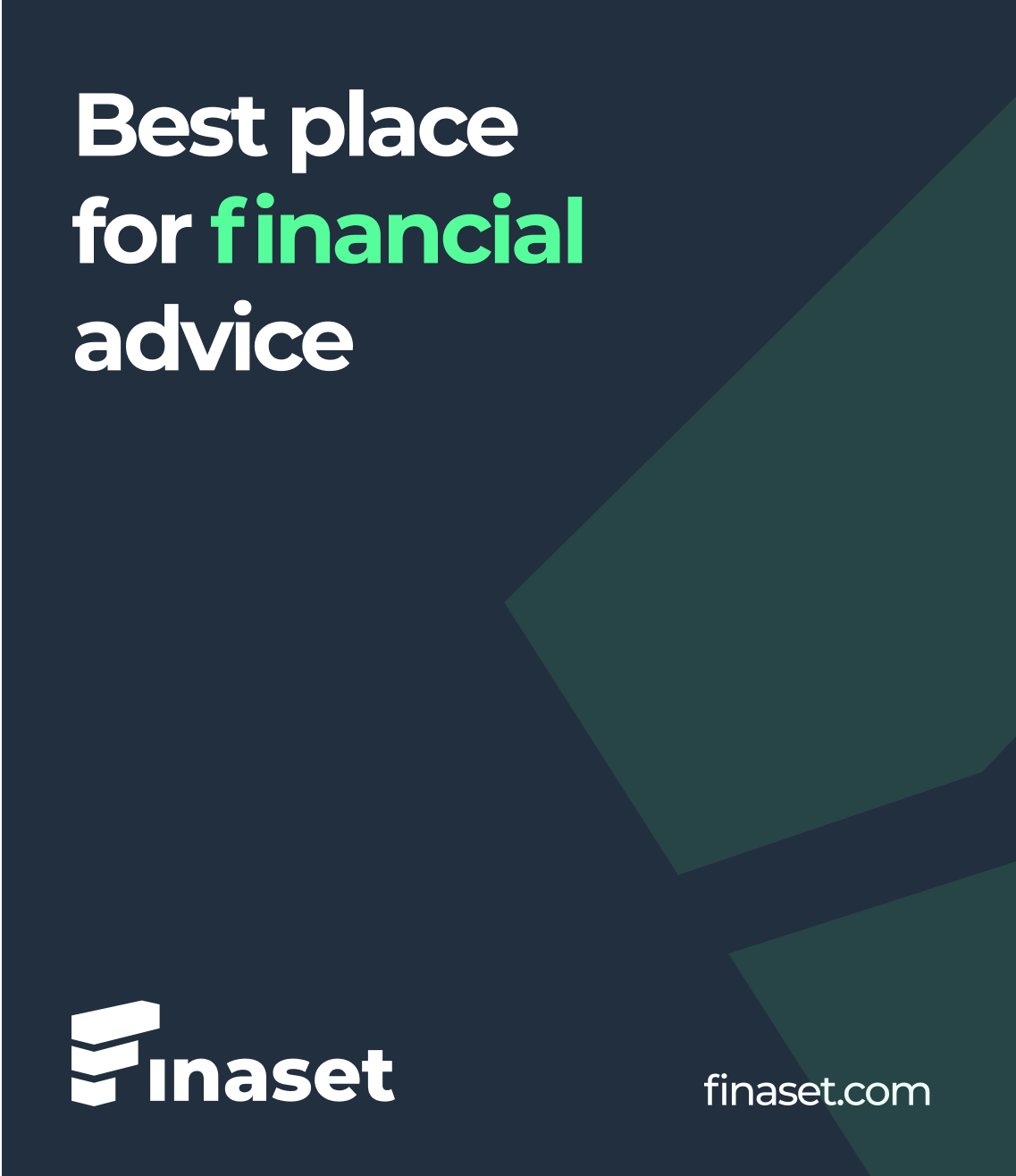
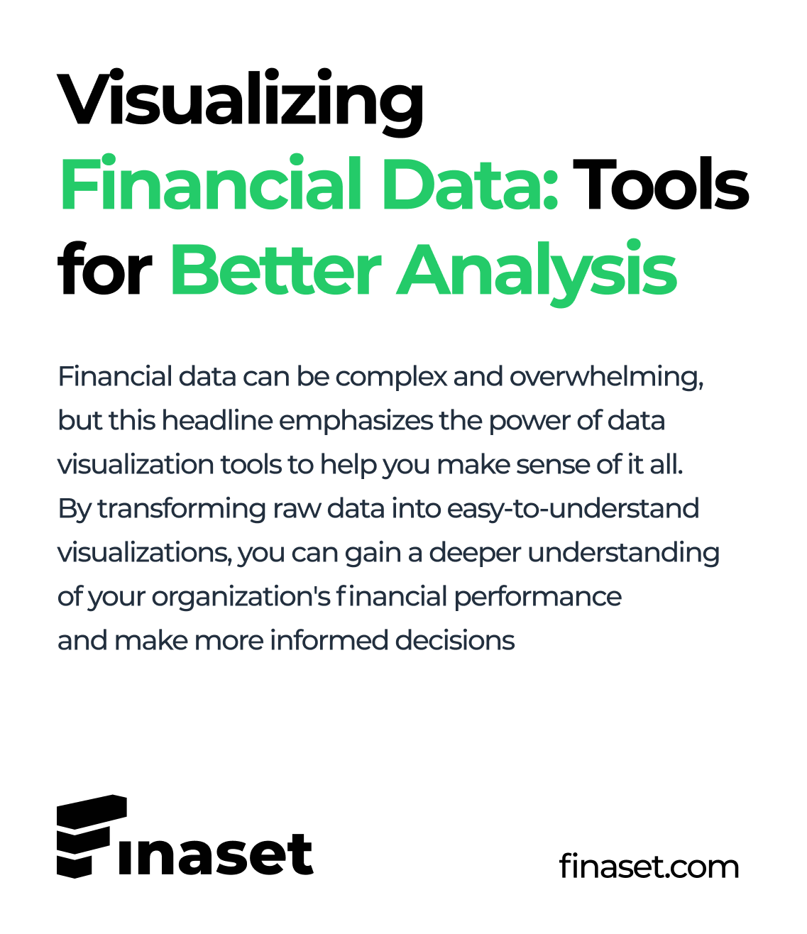
Minimalism, large typography, monochrome backgrounds, and simple geometry translate transparency and usability. Contrast is created by adding vivid imagery that audiences can easily associate with


mobile version
The interface of the mobile app continues the theme of brutalism, is easy to learn and does not burden the user with huge tables or finely prescribed data
Bogdan Danilov
Design
Sergey Kerber
Art-direction
RESULT
Finaset’s identity sets the brand apart in the market, targets a progressive audience, and creates associations with convenience and technology. Brutalism became the visual foundation of the project — this decision helped make the brand truly modern and ride the wave of the latest industry trends
STRATEGY AND CREATIVE ARE THE MOST IMPORTANT THINGS IN COMMUNICATIONS.
NOT EVERYONE UNDERSTANDS THIS, BUT IF YOU AGREE, IT WILL BE MORE PLEASANT FOR US TO DEVELOP AN OUTSTANDING PROJECT FOR YOU. TEXT US AND WE WILL COME UP WITH A SOLUTION
NOT EVERYONE UNDERSTANDS THIS, BUT IF YOU AGREE, IT WILL BE MORE PLEASANT FOR US TO DEVELOP AN OUTSTANDING PROJECT FOR YOU. TEXT US AND WE WILL COME UP WITH A SOLUTION

Digital agency
Сopyright 2024
@kerber_agency


