

pass24
This service helps to solve the problem of providing and managing passes for cars at large enterprises. Pass 24 allows you to create passes for different groups of users, create and delete them.
There is a possibility to create a one-time pass
There is a possibility to create a one-time pass
Personal account has different access levels: an interface for an administrator and an interface for a security guard. The security chief also has his own account
About the project

This service helps to solve the problem of providing
and managing passes for cars at large enterprises.
Pass 24 allows you to create passes for different groups of users, create and delete them.
There is a possibility to create a one-time pass
and managing passes for cars at large enterprises.
Pass 24 allows you to create passes for different groups of users, create and delete them.
There is a possibility to create a one-time pass
Personal account has different access levels:
an interface for an administrator and
an interface for a security guard.
The security chief also has his own account
an interface for an administrator and
an interface for a security guard.
The security chief also has his own account
This service helps to solve the problem
of providing and managing passes
for cars at large enterprises. Pass 24
allows you to create passes for different groups of users, create and delete them.
There is a possibility to create
a one-time pass
of providing and managing passes
for cars at large enterprises. Pass 24
allows you to create passes for different groups of users, create and delete them.
There is a possibility to create
a one-time pass


Task
Develop a convenient and understandable system for the passes control, taking into account different roles and their relationship.
Develop a convenient and understandable system for the passes control, taking into account different roles and their relationship
In the onboarding process the user is offered: to customize integrations, choose messengers for notifications and create groups with various access levels
System setting


Welcome screen


03
Entering the system for the first time, users see the empty dashboard. They can choose the role and fill in the data
02

01


Welcome screen
Main screen
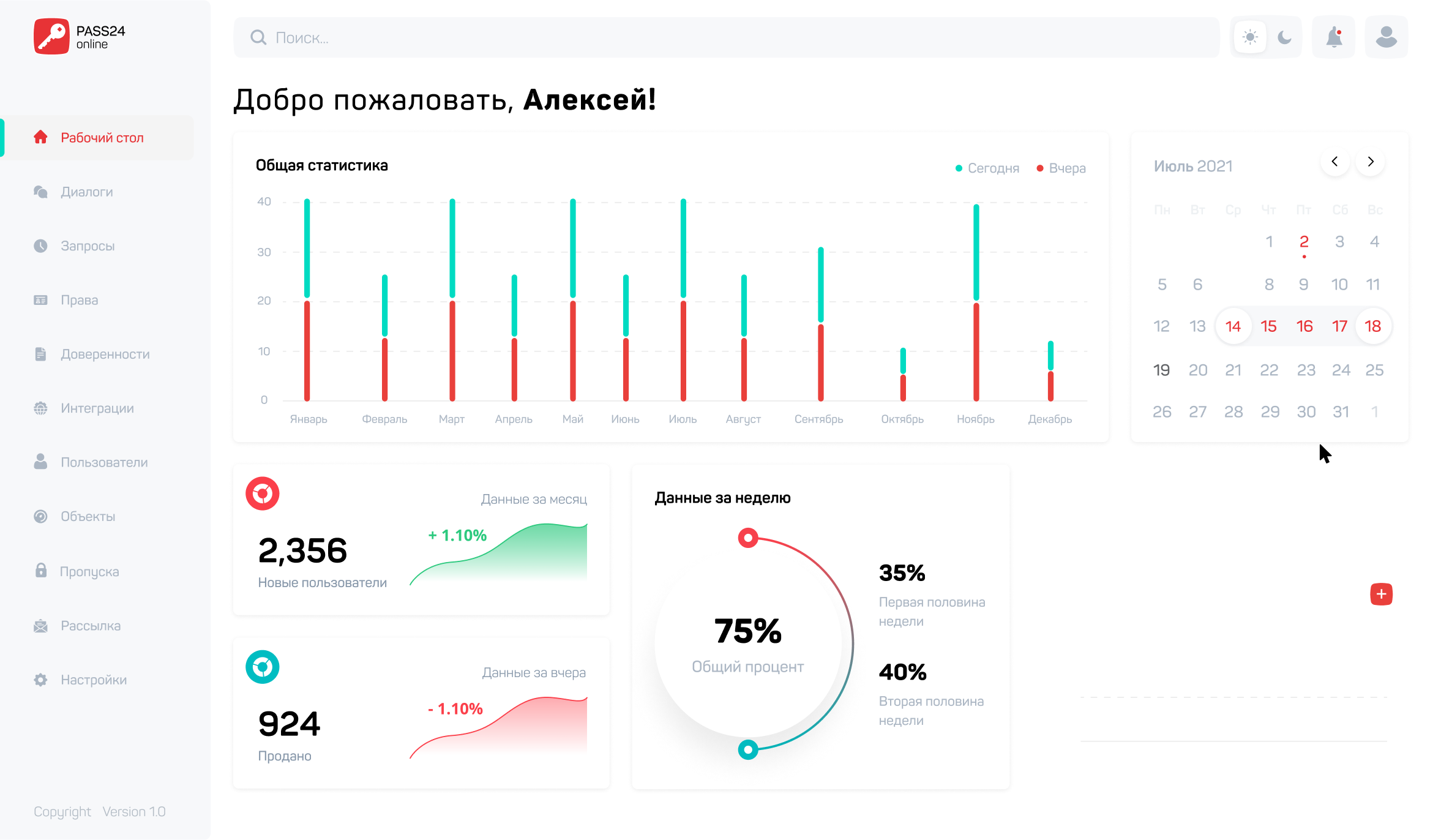
On the main dashboard the user sees statistics in different data sections depending on the access level

Menu
System search
Calendar
Theme
Analysis
of statistical data
of statistical data
Adding statistics

In the integration section the user can manage current integrations, delete and add new ones
Integrations


The interface provides a multi-level chat, built on the principle of enclosure. First a card with data, then a chat with the user
Requests and chats


Pass 24 gives the opportunity to issue temporary or permanent passes linked to car data

Passes

Popular sections on the type of notifications and window creation open in a pop-up window on the right side of the screen
Assisting window

End-to-end search allows to find the necessary information from any place in the interface
Search


The system supports a quick transition between user profiles, which allows to create one monitoring department for several groups of guards

Multi-profile system


The system supports a quick transition between user profiles, which allows
to create one monitoring department
for several groups of guards
to create one monitoring department
for several groups of guards
Profile
Сompany
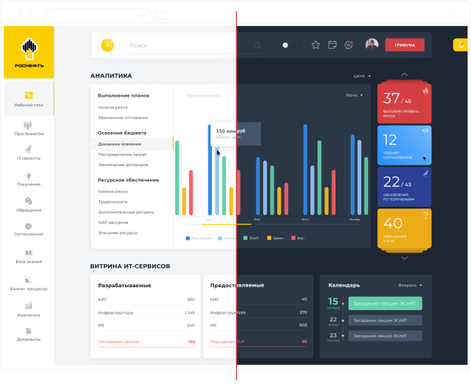
Light and dark
theme
theme
Car passes
Chats
Addresses
Other screens
There are more than 80 unique screens, each of them is worked out in 4 resolutions. There are more than 300 layouts totally
There are more than 80 unique screens, each of them is worked out in 4 resolutions. There are more than 300 layouts totally
On the one hand, minimalistic UI-elements with the same rounding allow you to preserve originality of the interface. And on the other hand, they don’t distract the user from the main thing
UI Kit
On the one hand, minimalistic UI-elements with the same rounding allow you to preserve originality of the interface. And on the other hand, they don’t distract the user from the main thing
Each screen of the system is adapted to all types of devices. It makes it convenient to use the system from a phone, tablet and computer
Adaptations


Each screen of the system is adapted to all types of devices. It makes it convenient to use the system from a phone, tablet and computer
Maxim Kolesnikov
Design UX/UI


Sergey Kerber
Art-direction
The result is a minimalistic interface, worked out in two color themes, with a simple and intuitive UX. At the moment, the system is being sold as a company product and is in demand in the market
Result


The result is a minimalistic interface, worked out in two color themes, with a simple and intuitive UX. At the moment, the system is being sold as a company product and is in demand in the market
The result is a minimalistic interface, worked out in two color themes, with a simple and intuitive UX. At the moment, the system is being sold as a company product and is in demand in the market

Digital agency
Сopyright 2024
@kerber_agency


