Conference Brand
BLACK SEA VETERINARY COMMUNITY
Brandbook 2022
brand philosophy & identity

Black Sea Veterinary Community is an association of representatives of the veterinary industry, as well as entrepreneurs and brands that work closely with this area. Connected by a single mission — the development of technologies and knowledge in the field of care and treatment of pets.
Brand philosophy
The goal of the brand language is to convey a feeling of lightness, friendliness and goodwill. At the same time create a sense of mentorship. The brand takes the being a friend and mentor upon itself. To create a comfortable, accessible system for the exchange and development of knowledge among representatives of the local and, in the future, the global veterinary community.
Brand language
The goal of the brand language is to convey a feeling of lightness, friendliness and goodwill. At the same time create a sense of mentorship. The brand takes
the being a friend and mentor upon itself.
To create a comfortable, accessible system
for the exchange and development of knowledge among representatives of the local and, in the future, the global veterinary community.
the being a friend and mentor upon itself.
To create a comfortable, accessible system
for the exchange and development of knowledge among representatives of the local and, in the future, the global veterinary community.
The basic emotional design language is in just four components:
1. Simplicity and confidence.
2. Lots of air. Smooth, but clear lines.
3. Minimalistic, two-component drawing of logos
(the figures are, as it were, “cut out” from the main color).
4. The colors are soft, matte and deep.
1. Simplicity and confidence.
2. Lots of air. Smooth, but clear lines.
3. Minimalistic, two-component drawing of logos
(the figures are, as it were, “cut out” from the main color).
4. The colors are soft, matte and deep.
Design language
Umbrella brand platform
After assessing the competitive market, we saw an opportunity to create a unique "umbrella" brand for this market segment. Which can combine extremely versatile tasks.
Such a system allows you to solve both B2C and B2B (& B2G) tasks, because the combination of several projects always looks bigger. And the first question that arose during the development of the visual was the system of inheritance of images. Firstly, we carefully transferred the past images and signs that have accompanied the events for 7 years. Secondly: we created a system of visual inheritance between new ones.
Symbolism
as a brand concept
as a brand concept


Nitrile glove


Community symbol
Jumping dolphin


Symbol
statements
statements


Business-forum symbol
Mountain bear


Medical cross

Conference symbol

Dolphin
over the waves
over the waves


Heraldic
shield
shield

Club symbol

Dog and cat


Sea
Emerald, clear water of the coastline. The flyers have been creating this image for years.
Sky
Clear sky on the sea horizon. When we dream of good things, there is no room for clouds in our thoughts.

Beach
Despite the fact that Sochi beaches are mostly pebbly, it is the yellow color of the sand of the coast that we imagine when we are away from the sea.

Night sky
The color of thoughtfulness and the predawn night sky. This is how we want to see the starry sky in moments of thoughtful walks.

Sun
Bright, warm sun. As well as the rich color of the sunset, which can only be seen on the seashore.

Color spectrum


Font and typefaces


Intent constructor:
Serious message
or Bright pitch?
Serious message
or Bright pitch?
We have developed a constructor that allows you to assemble a visual for any type of information using the inheritance of colors and images.

300+ graphic elements
Silhouettes of veterinary stuff
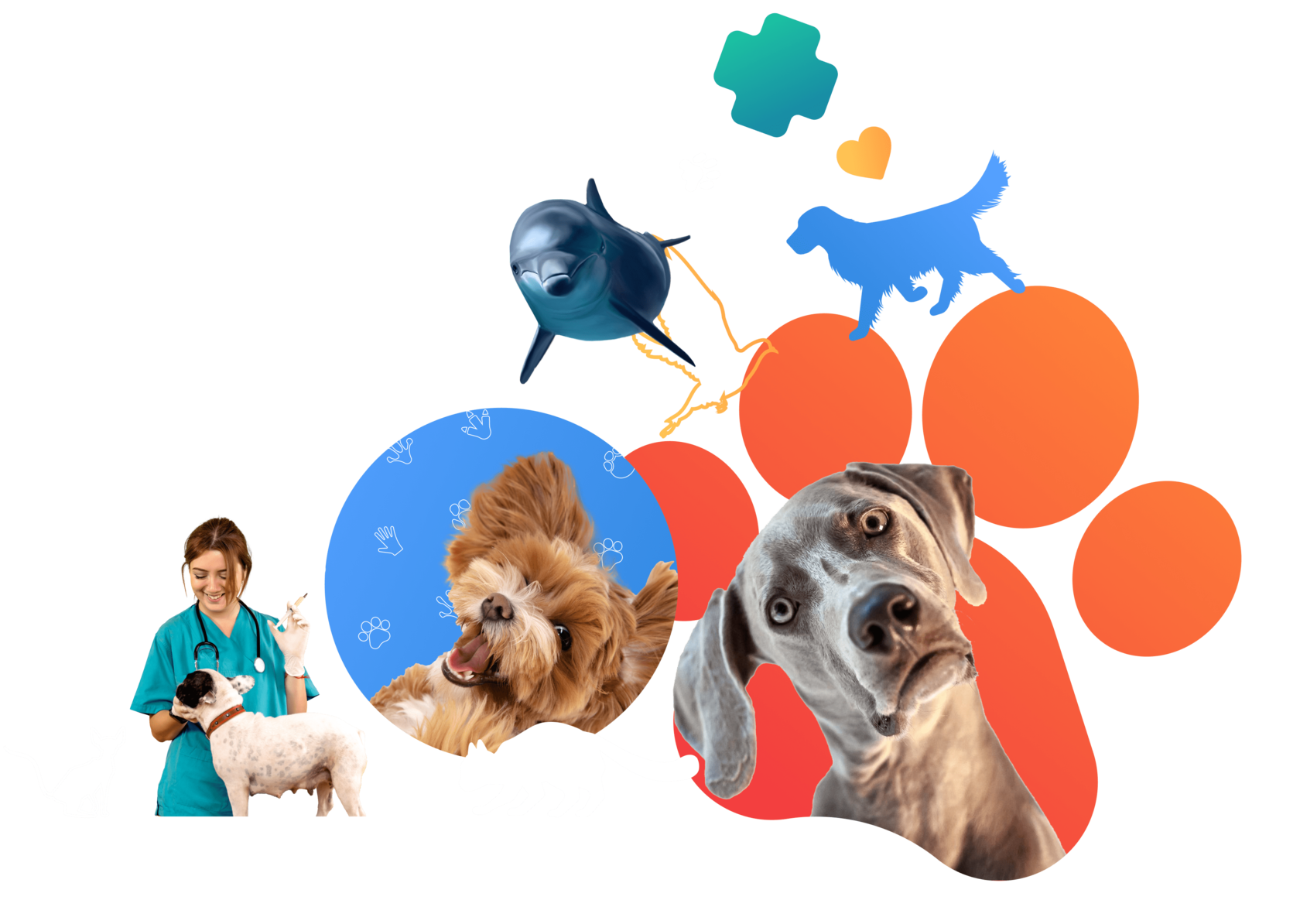
You can combine vector gradient silhouettes of veterinarians and raster photos of animals. Thus, showing their interaction and focusing on the care and treatment of the animals.


Sea creatures
You can use the provided elements or create your own.


Vector bright and gradient images of the Black Sea fauna, in all the variety of poses and movements of creatures, convey the power of vitality and joy. That emphasizes the image of everyone, and the whole brand as a whole.
Important!
Use simple and recognizable images of waves, without pronounced accents. So that the user is not distracted by the analysis of the pattern.
Sea waves
Unique vector patterns of sea waves, symmetrically and proportionally located as to each other, create a background pattern for required design project emphasizing brand identity.
Patterns
Important!
Do not change the proportions of the elements. Otherwise, they may look distorted, inconsistent with the natural proportions of animals.
Animals as an element
Previously used, vector graphic elements, such as animals, can also be used as a unique pattern. Arranging them symmetrically and proportionally as to each other, creating a background pattern and emphasizing belonging to the brand.


Raster graphic elements
Cute animals with glasses and toys in a funny pose evoke positive emotions, increasing brand loyalty.
Animals and people as an element
Use photorealistic images of people and animals without a background. To create a vibrant and positive image for your publication.
Photo with gradients
Use gradient patterns in combination with neutral backgrounds, positive photos of animals and people
Patterns and photo objects
Combine realistic photos with bright gradient backgrounds. It is acceptable and encouraged to use patterns as a design element.
Patterns and photo objects
Use a combination of dark backgrounds with gradient patterns. But don’t forget about the balance and readability of the body text.
Vector animal figures
Use graphic, associative images of animals in a gradient fill or outline. In this case, they become the center of the composition
and attract attention.
and attract attention.
Live Photos and Gradient Shapes
Create posts and banners with live photos of people and animals. To add zest, you can use thematic icons made in contour graphics.
Graphic techniques from images
Important!
Watch for a color balance of 70% neutral colors
(white, blue, green, black, grey) and 30% accent gradient.
(white, blue, green, black, grey) and 30% accent gradient.
General brand visual offline
All visual techniques are allowed.
Patterns, photos and graphic objects of animals and veterinary workers.
Patterns, photos and graphic objects of animals and veterinary workers.
Using brand elements in digital
Must use color contrast, dark gradient backgrounds
and bright buttons of accent colors.
and bright buttons of accent colors.
Important!
Do not forget about the balance and appropriateness of color.
No need to make a black or color page for an important text document.
No need to make a black or color page for an important text document.
Brand offline
General brand visual offline
Brand visual is built on contrast
and the interweaving of meaning with color.
and the interweaving of meaning with color.
The same should be observed offline, using a combination of approaches for handout designs. Don’t do everything in one pattern. Use various backgrounds for different pages in the same brochure, highlighting transition pages, for example.

Important!
Strike the color balance, do not go too far in one color or another. Do not combine more than 2 backgrounds at the same time (a combination of a branded background and black is appropriate).
Design of racks and banners
Create color combination. Make composite racks: part of the rack with a bright background (depending on the brand) and another one on a black background representing the combined brands.
Since the dark part stands out better, use this place wisely, clearly emphasizing. And remember that everything dark needs a balance of light.
Since the dark part stands out better, use this place wisely, clearly emphasizing. And remember that everything dark needs a balance of light.
Observe the contrast and balance of colors.
If the background is dark, then the text should be white. If there is not enough zest, add an element from an accent gradient or color to the background.
If the background is dark, then the text should be white. If there is not enough zest, add an element from an accent gradient or color to the background.

Stand design
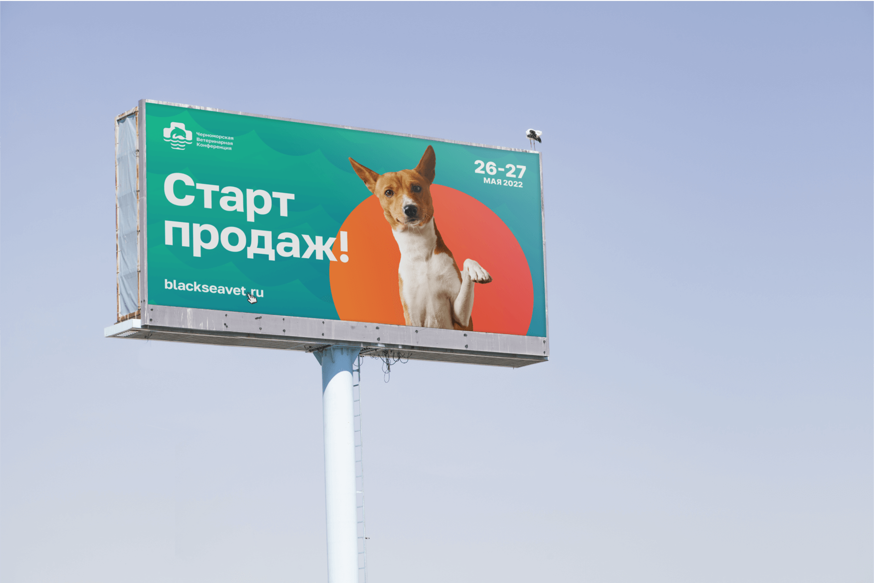
Outdoor advertising


Concept-direction
Mikhail Andreev-Borodin
Sergey Kerber
Art-direction
Design Senior, branding development
Bogdan Danilov
Design, development of promo materials
Alyona Rakhimova
Result
The Black Sea Veterinary Conference expresses gratitude to the KERBER studio team. The studio showed a high degree of organization and completed the task at a professional level. Within three months of tight collaboration, the branding of the conference and all related projects was fully developed.


The Black Sea Veterinary Conference expresses gratitude to the KERBER studio team. The studio showed a high degree of organization and completed the task
at a professional level. Within three months of tight collaboration, the branding
of the conference and all related projects was fully developed.
at a professional level. Within three months of tight collaboration, the branding
of the conference and all related projects was fully developed.
Digital agency
Сopyright 2024
@kerber_agency


